2
.
1
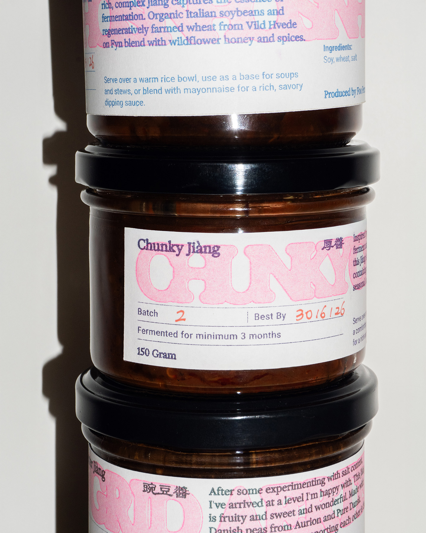
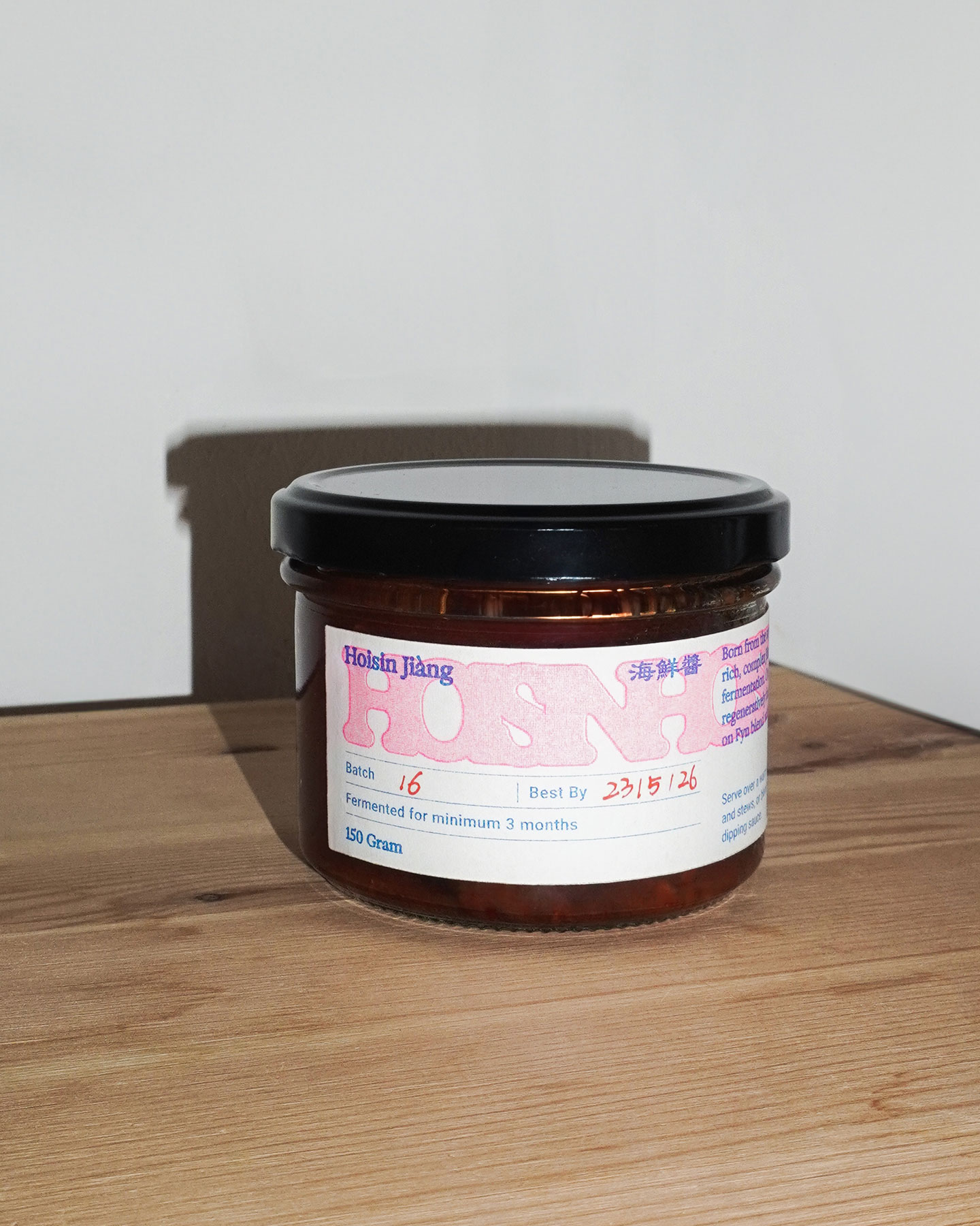
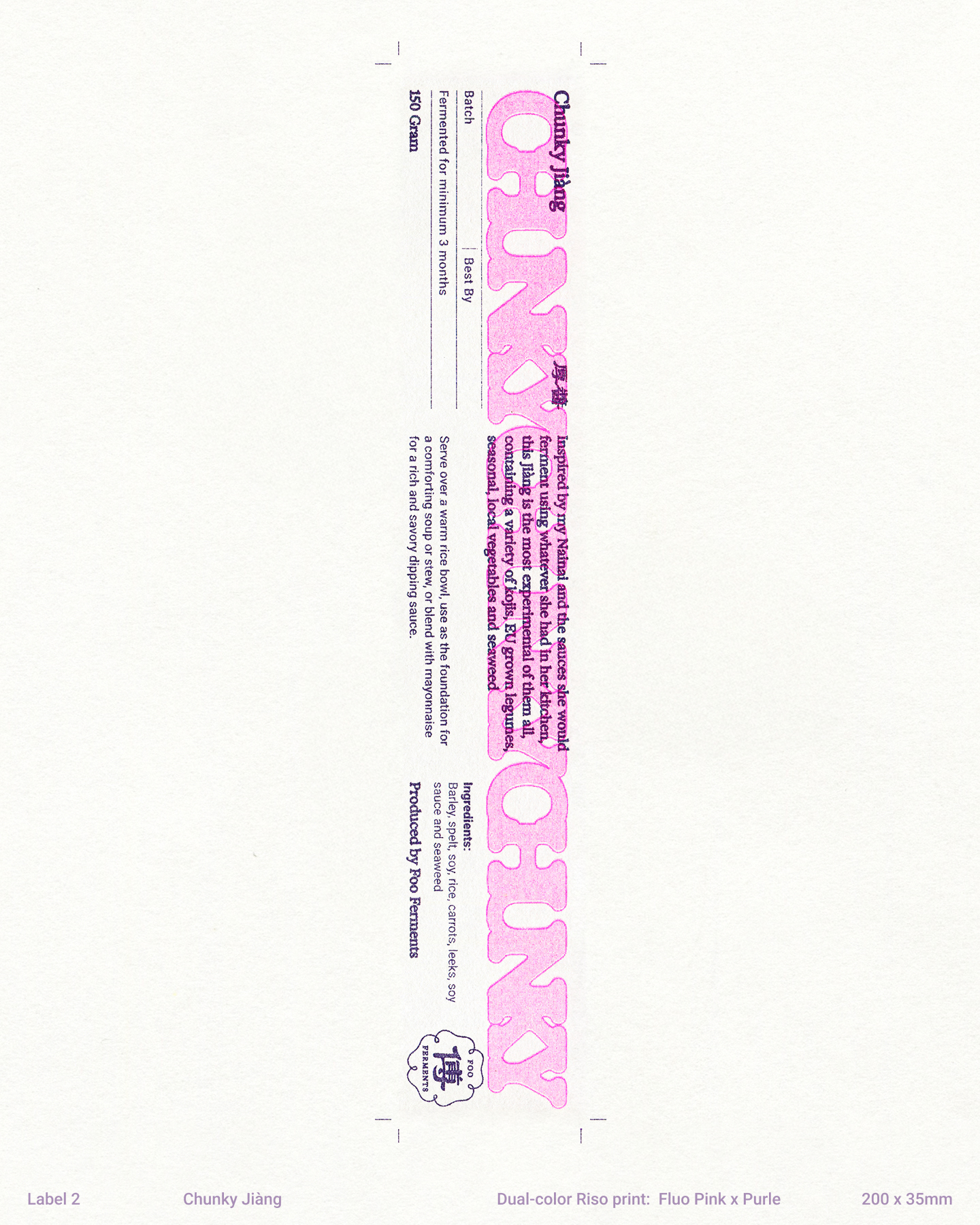
Hoisin Jiàng
2
.
2
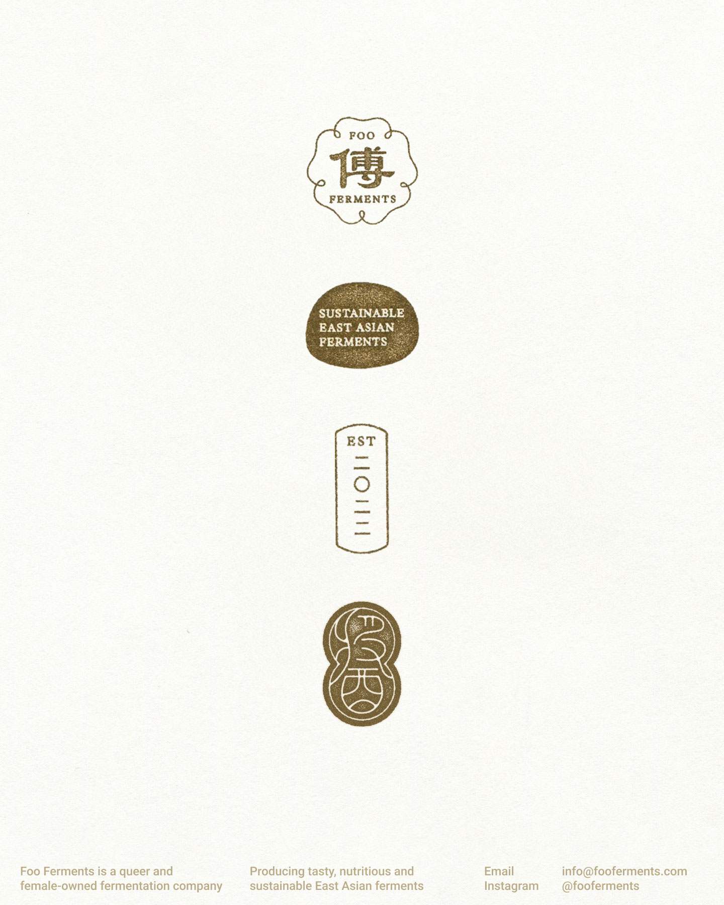
Stamps
Our identity for Foo Ferments is deeply rooted in the slow, thoughtful craftsmanship of fermentation, emphasizing the tactile warmth and raw beauty inherent in the process. Drawing inspiration from traditional Chinese stamps—signatures passed down across generations, symbolizing authenticity and heritage—we created a stamp toolkit that echoes the intentionality behind fermentation: patient, careful, and shaped by human hands. The labels we created for Foo Ferments carries this same mark of authenticity and care, bridging heritage with contemporary expression.
“What I make today is connected to what came before me—different, but still carrying the same essence,” Lan-xin reflects. Inspired by her perspective, our reinterpretation of traditional Chinese stamps expresses this interplay between preservation and change. The identity captures a fluid conversation between past and present, remaining open to the beautiful unpredictability that fermentation brings.
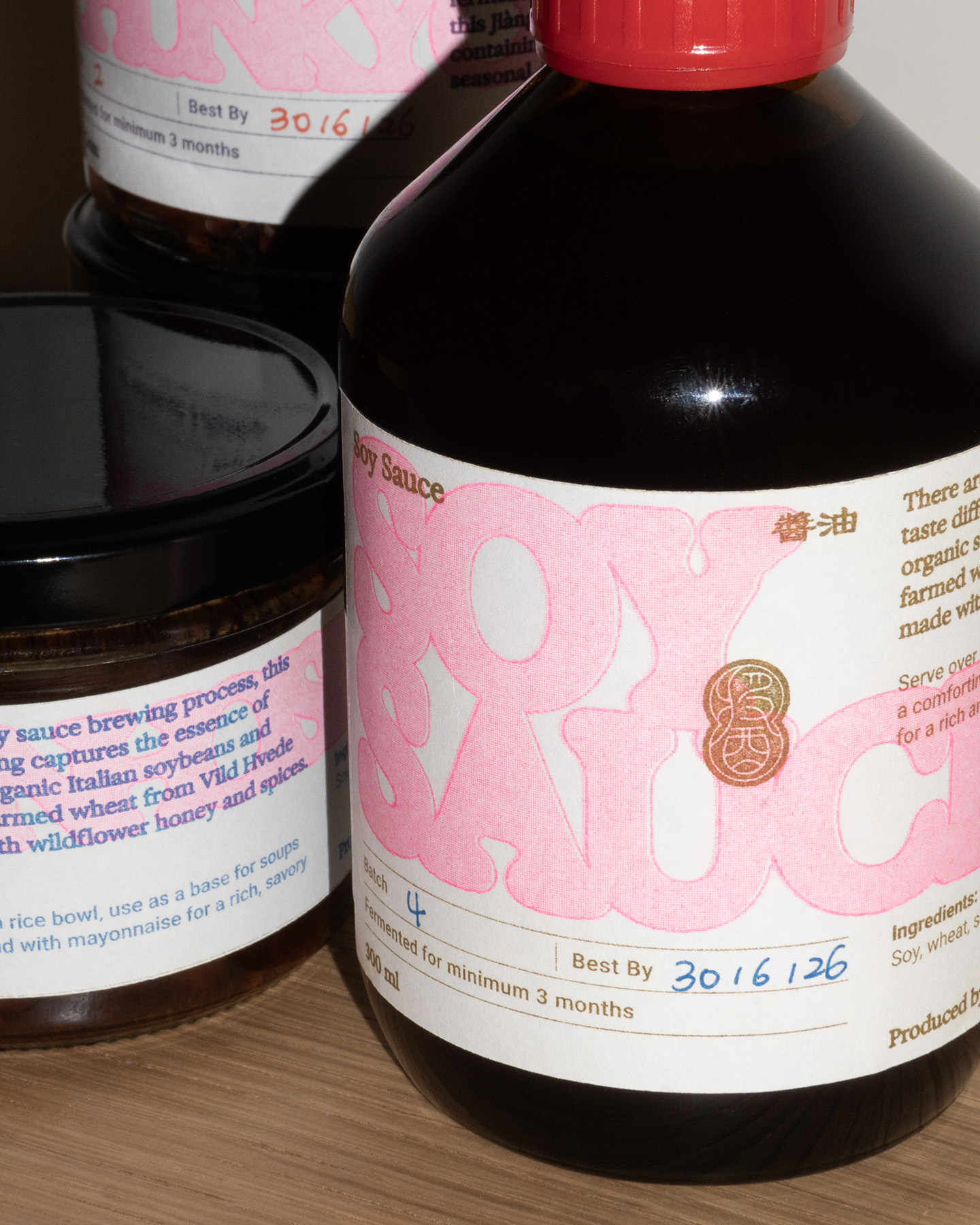
We chose riso printing for its natural imperfections—uneven textures, subtle shifts in ink—mirroring the organic surprises of fermentation itself. Just as no two batches of Foo Ferments products are identical, every print varies slightly, shaped by the unpredictability inherent in the process. Our design language embraces these gentle irregularities, celebrating both the unexpected beauty and the iterative, patient cycles of trial and error.
Foo Ferments’ identity reflects more than just the final product—it embodies the process itself: the patience, experimentation, and nuanced transformations. Like fermentation, the visual identity we’ve developed remains open, flexible, and responsive to change.
2
.
3
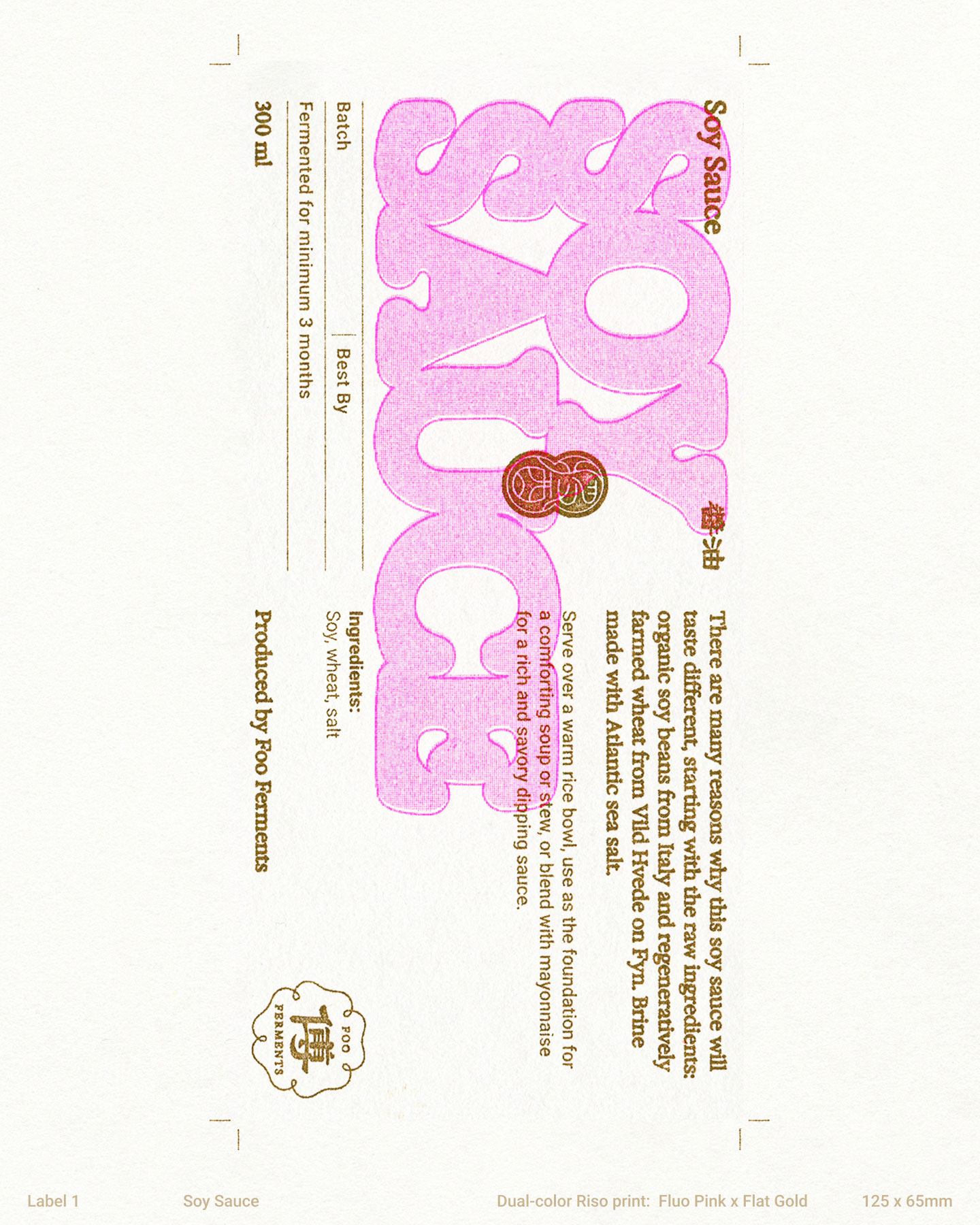
Riso printed label
2
.
4
Label Design
2
.
5
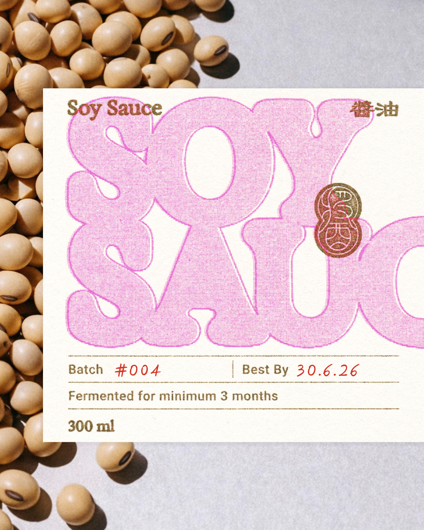
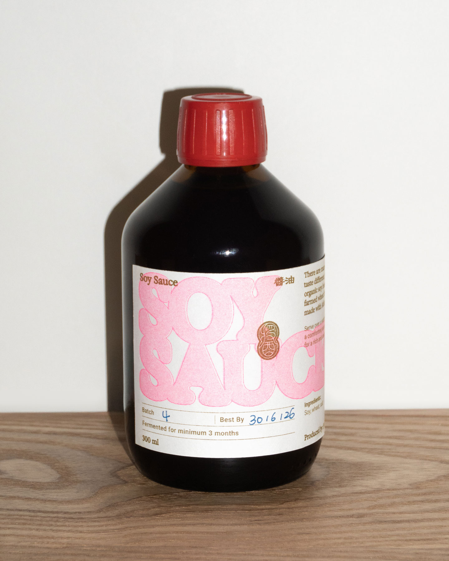
Soy Sauce
2
.
6
Label Specs
2
.
7
Label Specs